I’m going rogue on this one. While everyone bashes the Cleveland Browns for their subtle uniform change, I’m not ashamed to say I support the move and I’m frankly quite relieved.
When I saw the headline about the Browns, one of the NFL’s most iconic franchises, tinkering with their look I was ready to throw in the towel. With Roger Goodell systematically ruing the game with idiotic rule changes and his obsession with London, the last thing we need is a uniform change of one of the most storied clubs in sports.
Why in the name of Otto Graham can’t we leave anything alone?
The Cleveland Browns are unique and easily recognizable. They’re the only team with no logo on either side of their helmet. They remain the only major sports franchise with brown as one of their base colors. Therefore, when people see them, they automatically recognize them. That’s a good thing. It’s not a fashion contest—it’s sports.
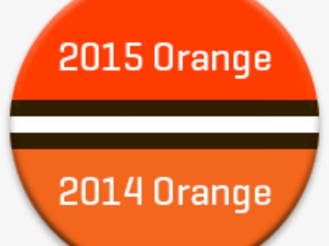
Before I clicked on the link that led me to the new Browns helmet, I held my breath anticipating a dog or a brownie or a ‘B’ or a ‘C’ emblazoned on the side. I was pleasantly surprised to find that helmet still delightfully clean of any logo. At first I thought, “where’s the new helmet?”—not realizing I was looking at it. Basically, all the Browns did was change the shade of orange and make the facemask brown. Necessary? Probably not. But at least no harm was done. The helmet worn by the great Jim Brown still looks like the helmet worn by the not-so-great Browns.
The Twitterverse attacked like the Browns defense of the 80s. We’re not talking just Steelers, Ravens, and Bengals fans, either. The Browns were blasted from near and far. Their own fans and those who just want to be part of the auxiliary fashion police chimed in.
One keyboard warrior wrote that the combo of orange and brown went out in the 1970s. Perhaps for leisure suits, but this is a sports team. Can’t they stand out and be a little old school in the process? Must all teams look the same?
I’m not sure what they wanted the team to do but I’m happy the Browns still look like the Browns.
This is the description from the team’s web site regarding the move: “Our updated helmet logo is reflective of today’s modern Cleveland — the design honors the past while evolving into the future. The iconic brown and white stripes stand tall over the orange helmet — a new orange color that matches the passion of the Dawg Pound. The new brown facemask represents the strength and toughness of Cleveland.”
The Dolphins, Falcons, Cardinals, Jaguars, and others have made less than drastic changes to their helmets in recent years. No overhauls, just different sizes or expressions. These teams were not ripped this hard. That’s probably because it’s a lot harder to change a solid color than it is to alter an animal. I suppose some wanted the Browns to look altogether different. That would’ve been a shame.
In today’s professional sports world uniform changes usually mean one of two things. The addition of a black jersey or a ridiculous new logo that makes the team completely unrecognizable to those who have watched them for years. In hockey and baseball, in particular, we have seen countless teams add black shirts making numerous uniforms look almost, for lack of a better term, uniform. Were the Astros’ Technicolor dream unis or the Padres’ duds straight from behind the McDonald’s counter pretty per se? No—but they were synonymous with the clubs and their cities. When you saw those uniforms, no matter how gaudy they may have struck you, you thought ‘Stros or Pads instantly.
We’ve seen honchos for the Islanders, Sabres, Pistons, Warriors, Cavaliers, and others leave their uniform decisions to the board room. As a result, their teams have donned some of the most repulsive uniforms in history. All of these franchises, some quicker than others, eventually went back to their classics. Fans demanded it. The Isles are known for their orange and blue and NY hockey stick design, not the Gorton’s fisherman. Buffalo hockey fans are accustomed to a bison and his weaponry as opposed to a sweater that appeared to have Donald Trump’s hair on it. The Pistons are finally back to that Domino’s pizza-box look after years of a debacle in teal. The Warriors and Cavs no longer look like store-brand cereal boxes, instead opting to return to resembling NBA organizations. The Browns didn’t fall into this trap, and won’t have to go back to what already works.
You’d never see the Yankees, Canadiens, Celtics, Packers, or Bears do anything rash to their uniforms. The Browns shouldn’t either.
The state of professional sports, not unlike the state of our union, is in peril. While DC bureaucrats shred our Constitution by stripping our freedoms and liberties at every turn, empty suits in sports dance on the graves of Doubleday, Naismith, and Camp by killing the games we love all in the name of keeping the attention of those who can’t pay attention. So, while we’re adding wild cards, replays and challenges, and dumping strike zones, plays at the plate, PATs, kickoffs, and tackling, can we at least keep the uniforms of our historic teams somewhat intact, even if it doesn’t sit well with the Katy Perry/Lady Gaga set?
If the Browns want to stop the uniform criticism and never hear it again, there’s a surefire way to do just that. Sign Tim Tebow today.

COMMENTS
Please let us know if you're having issues with commenting.